

B2B SaaS Website Design: What We Built for a Link Building Platform
A B2B SaaS website design example with the numbers attached. We designed and built the marketing site for Pressmerit, a link building platform that finds publishers across the open web, verifies the contact, drafts the pitch, and re-checks every published link every 30 days.
Overview
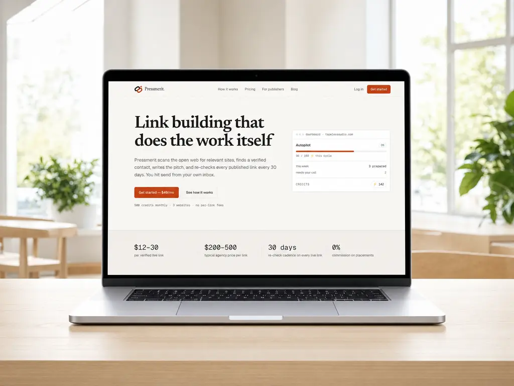
This is a B2B SaaS website design project for Pressmerit, a digital-PR and partnership platform used for link building. The software reads your site, searches the open web for publishers worth writing to, scores each candidate, finds a verified contact, and drafts the pitch. You send it from your own mailbox. When the link goes live, the platform verifies it and re-checks it every 30 days.
We handled the marketing site end to end: positioning, information architecture, the visual system, the interface fragments used across the pages, the copy, and the technical SEO layer. Thirteen pages, one language, built on Next.js and shipped to Vercel.
The brief carried one hard constraint. Link building is a category buyers have been burned in, so the site could not sell the way this category usually sells. Every claim had to arrive with its own evidence, and every price had to sit on the page before anyone signed up. If you want the general version of this argument, our guide to SaaS website design covers the page set and the costs.
Challenge
Three problems arrived together.
The product is a pipeline, not a feature. Analyze, discover, pitch, send, verify. Explaining that as a list of features would have lost the point, which is that the software does the legwork and stops at the two decisions a person should make.
There were no screenshots to use. The product was pre-launch, and real customer data does not belong on a marketing page anyway. Stock dashboard mockups would have read as exactly what they are.
And the site had two audiences that never overlap. SEO buyers evaluating a $49 subscription, and publishers who received an outreach email and want to know who wrote to them before they answer. Serving only the first would have quietly damaged the product's reputation with the second, which is the kind of problem that shows up months later in reply rates.
See our pricing plans for how we scope work like this.
How We Designed the B2B SaaS Website
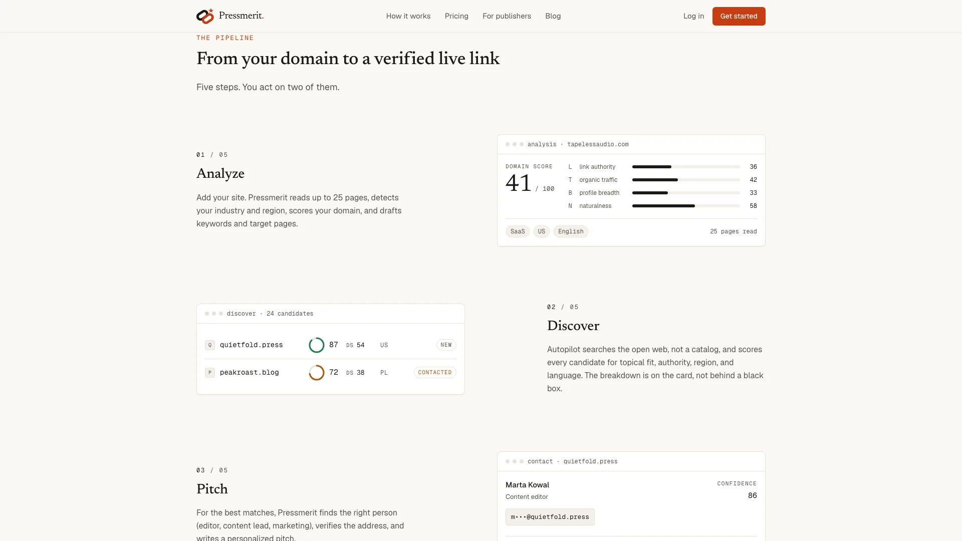
The pipeline set the structure. The homepage walks through the five steps from a domain to a verified live link and marks the two where the user acts. A long-form page expands the same pipeline into eight stages with an anchor each, including the parts the platform cannot do. Everything else on the site hangs off a stage, so the navigation is a map of the product rather than a list of departments.
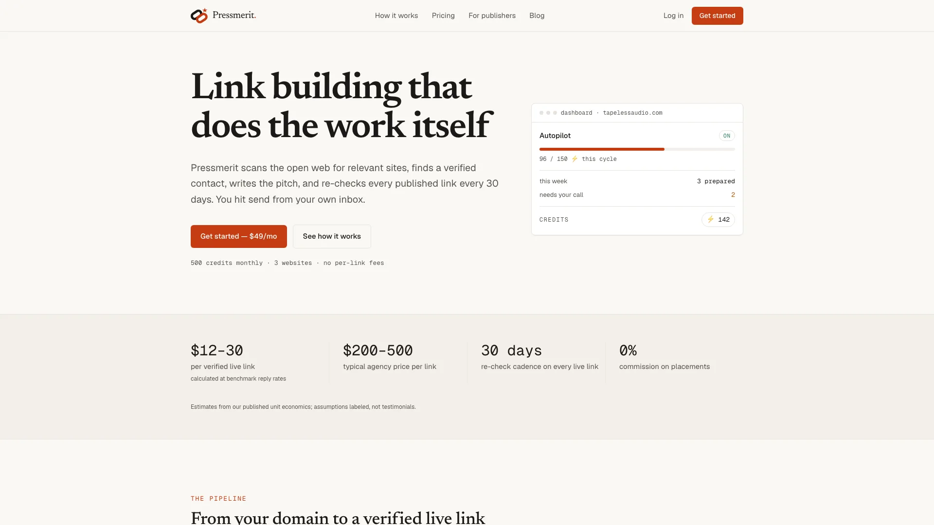
Instead of screenshots, we rebuilt the interface as fragments in code: an analysis card with the components of its domain score, a scored prospect list, a verified contact with a confidence value, a drafted pitch, a monitoring timeline. Each fragment uses example data from fictional sites and says so in the caption underneath. They render as text and CSS, so they stay sharp at any resolution, cost almost nothing to load, and can be edited when the product changes.
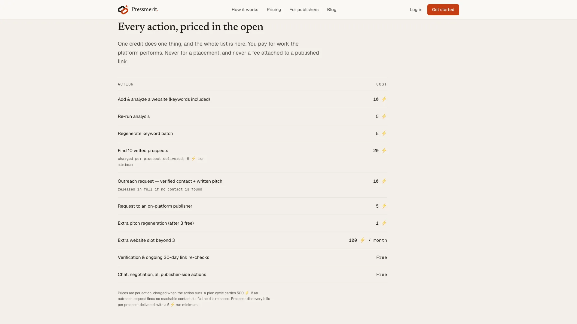
Pricing is published in full. The plan, the entire per-action credit table, a worked example of a realistic month, and an estimator that runs the same arithmetic as the table above it. Nothing is held back for a sales call, because there is no sales call.
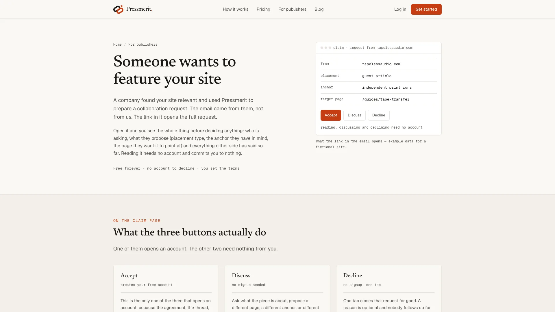
The publisher side got its own pages. One explains what a collaboration request is and what its three buttons do, one answers why someone received the email, and one documents the verification crawler with its user agent and schedule. They exist to be linked from the outreach email itself, which is where the trust question actually gets asked.
The visual system is editorial rather than SaaS-generic: a serif face for headings, monospace for labels, data, and interface chrome, and one warm accent. Interface fragments read as interface, prose reads as prose, and neither competes with the other for attention. That split is doing more work than it looks like it is, because it lets a long page stay scannable without a single decorative illustration.
SaaS Website Design Examples From the Build
Four pages from the live site, each one solving a different part of the B2B SaaS website design problem.
Result
The site launched at 100 for Performance, Accessibility, Best Practices, and SEO on desktop Lighthouse. Largest Contentful Paint at 0.5s, zero layout shift, zero total blocking time. On mobile, Performance sits at 96 with the other three categories still at 100.
Those numbers come from the same decision that shaped the design. Building the interface fragments as markup instead of images meant the heaviest visual elements on the page cost a few kilobytes of HTML, so there was no image budget to optimize away later. Most performance work on a marketing site is really a design argument that happened earlier, as Google's Core Web Vitals guidance keeps demonstrating.
Every page is server-rendered, carries Organization, WebSite, SoftwareApplication, and FAQPage structured data, and appears in an llms.txt index with a one-line summary. The FAQ blocks were written as questions people type, which is what makes them usable by AI search engines as well as by Google.
The publisher pages did something we did not expect to matter as much as it does. They turn the outreach email into a two-way document. A publisher who gets a request can read who is asking, what the platform is, and how to opt out, without an account and without replying first.
Results
Lighthouse audits at launch, desktop and mobile.
What to Copy From This B2B SaaS Website
Six decisions from this build transfer to most B2B SaaS website design projects, whatever the product does.
Let the product set the page order. If the software runs a sequence, the site should run the same sequence. A feature grid asks the visitor to assemble the story themselves, and most of them will not bother.
Put the interface on the page as markup. Rebuilt UI fragments beat both stock mockups and real screenshots. They load faster, they survive a redesign of the product, and you can label example data honestly instead of implying a customer base you do not have yet.
Publish the prices. For anything self-serve, the pricing page is the sales call. Publish the unit economics and let the visitor do the arithmetic before signing up.
Write the limits down. Saying what the product cannot do is the cheapest trust signal available, and it filters out the leads that would have churned in week three.
Give the second audience its own pages. Most B2B SaaS products touch someone besides the buyer: an approver, a partner, a recipient. Those people are one search away from your site, and a page written for them protects the reputation of the product.
Treat performance as a design decision. Choosing markup over image files at the design stage is what produced the 100 Lighthouse score, not a round of optimization at the end. Our B2B website design guide goes deeper on the structure side, and UX/UI design covers how we run the design phase itself.
Tech Stack
| Area | Tooling |
|---|---|
| UX/UI | Figma |
| Frontend | Next.js, TypeScript |
| Styling | Tailwind CSS, custom components |
| Interface Fragments | HTML and CSS, no image assets |
| Optimization | Technical SEO, Core Web Vitals, static rendering |
| Structured Data | Schema.org Organization, WebSite, SoftwareApplication, FAQPage |
| AI Search | llms.txt index with per-page summaries |
| Hosting | Vercel |
Need a B2B SaaS Website?
We design SaaS marketing sites that explain the product in plain language and turn visitors into signups.
Case FAQ
Common questions about B2B SaaS website design, answered from this project.