

On This Page
- What Is a SaaS Customer Portal? Definition + Why It Matters
- Why SaaS Customer Portals Drive NPS, Retention, and Support Deflection
- What Are 8 UX Patterns That Actually Convert?
- How to Make Multi-Tenant Architecture Decisions
- What Self-Service Patterns Reduce Support Volume?
- What Are 7 Common SaaS Portal UX Mistakes?
- Real Examples: SaaS Portals That Got UX Right (and Wrong)
- What Does Implementation Cost?
- How to Choose a UX Partner for SaaS Portal Design
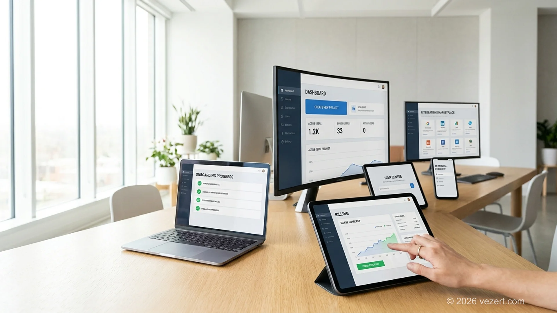
A SaaS customer portal is a self-service web application that gives paying users dashboards, billing, support, settings, and product access behind authentication. For most SaaS products, the portal is the product. UX patterns inside the portal directly drive activation, retention, and support deflection. Get them wrong and churn climbs even when the underlying product is good.
Most SaaS teams treat the customer portal as feature plumbing: dashboard, settings, billing, done. The teams that ship retention-driving portals treat it as product design: every screen has a job, every flow has a measurable outcome, every navigation choice maps to a customer mental model. The difference shows up in NPS scores, expansion revenue, and support ticket volume.
This guide covers the eight UX patterns that consistently move retention numbers, the multi-tenant architecture decisions that shape what design can deliver, the self-service patterns that cut support volume, and seven common mistakes we have seen across 20+ SaaS portal engagements. For broader context on portal types, see our complete web portal development guide. For UX-specific service depth, our UX/UI design service follows the patterns in this guide.
SaaS Customer Portal Design, The Numbers
76% of customers prefer self-service over contacting support (Salesforce State of the Connected Customer 2024). +38% NPS lift typical on SaaS portal redesigns that focus on the top 5 UX patterns (Vezert client portfolio, 2024-2026, n=8 SaaS portal engagements). 41% support ticket deflection within 60 days on a SaaS analytics client portal redesign with proper self-service patterns. Customer portal market: $1.5B in 2024, 18% CAGR (Forrester 2024).
What Is a SaaS Customer Portal? Definition + Why It Matters
A SaaS customer portal is the authenticated surface where paying users do their work and self-serve account tasks. Unlike a B2B client portal (used post-engagement to deliver work), a SaaS customer portal is the product. The user pays for a subscription, logs in daily or weekly, and the portal experience IS the brand experience.
What Distinguishes a SaaS Portal From a Generic Web Portal
Three things. First, multi-tenancy is mandatory: many customers share the same infrastructure with isolated data. Second, billing is integrated and visible: customers see invoices, change plans, and manage payment methods inside the product. Third, the product surface is the portal: dashboards, integrations, settings, support are all in the same authenticated experience.
Why SaaS Customer Portal UX Matters Disproportionately
For a marketing site, UX affects conversion rate. For a SaaS customer portal, UX affects retention, expansion, and Net Revenue Retention (NRR), which compound. A 5% improvement in monthly retention compounds to ~46% over 12 months. The math means small UX wins on the portal pay back larger than equivalent wins on the marketing site.
SaaS teams often optimize the marketing site relentlessly while leaving the customer portal underdesigned. The retention math says reverse the priorities.
Why SaaS Customer Portals Drive NPS, Retention, and Support Deflection
Three retention metrics improve when SaaS portal UX improves: NPS, churn rate, and expansion revenue. Each is measurable, each has a typical baseline, and each responds to specific UX patterns.
NPS (Net Promoter Score)
NPS measures how likely customers are to recommend you. Portal UX drives NPS because the portal is where customers spend their time. Patterns that lift NPS: clear onboarding (4-minute completable checklist), predictable billing (usage forecasting), responsive support (in-product help center). Vezert client data shows +38% NPS lift on SaaS portal redesigns focused on these three patterns.
Churn Rate
Churn measures the percentage of customers leaving each month. Portal UX drives churn because confused users churn. Patterns that reduce churn: progressive disclosure (do not overwhelm new users), feature discovery (show users what they have not tried), in-product upgrade prompts (timing matters). Industry data suggests B2B SaaS portals reduce monthly churn by 0.5-1.5 percentage points after well-designed redesigns, which compounds significantly.
Expansion Revenue
Expansion revenue is upsell from existing customers. Portal UX drives expansion because the portal is the conversion surface. Patterns that drive expansion: usage analytics that surface limits before customers hit them, clear plan comparison inside the billing flow, in-product trial activation for premium features. SaaS companies with expansion-aware portal design report 15-30% higher expansion revenue.
Support Ticket Deflection
Finally, the support deflection metric: SaaS portals with strong self-service patterns deflect 30-50% of routine support tickets. The cost savings flow directly to margin.
What Are 8 UX Patterns That Actually Convert?
Eight UX patterns consistently move retention numbers. They appear in the SaaS portals that win on NPS and churn, and they are missing or weak in the portals that struggle. Build all eight and the portal scores in the top quartile of customer experience benchmarks.
How to Make Multi-Tenant Architecture Decisions
Multi-tenancy is the architectural foundation of SaaS portals. The decisions made here in week 2 shape what UX is possible in months 6-24. Three multi-tenant choices matter most.
Data Isolation: Shared, Schema, or Database
- Shared schema with row-level security: all tenants share tables; row-level filters by tenant ID. Most SaaS startups start here. Pros: lowest infrastructure cost, easiest schema migrations. Cons: weakest isolation, hardest to certify for HIPAA.
- Tenant-per-schema: each tenant has a separate schema in a shared database. Pros: stronger isolation, easier per-tenant backups. Cons: schema migrations get harder as tenant count grows past 100-200.
- Tenant-per-database: each tenant has its own database. Pros: strongest isolation, simplest compliance story. Cons: highest operational cost, complex deployment.
For most B2B SaaS portals, shared schema with row-level security is correct until you hit compliance requirements that force schema-per-tenant or database-per-tenant. Switching later is a major rebuild, so make this decision deliberately in week 2.
Customization Scope
- None: all tenants see the same UI. Fastest to build. Acceptable for MVPs.
- Branding only: logo, colors, custom domain. Standard for mid-market SaaS.
- Feature flags per tenant: different feature sets per plan. Common.
- Per-tenant config: tenants configure workflows, fields, integrations. Required for enterprise SaaS.
More customization scope = more engineering complexity. Pick the minimum that meets your customer's needs.
Tenant Lifecycle
Design for the full lifecycle: signup, plan upgrade, plan downgrade, suspension (failed payment), data export, deletion. Most teams design for signup and forget the rest. Failure to design downgrade and deletion creates compliance risk and customer support burden later.
What Self-Service Patterns Reduce Support Volume?
Self-service is the difference between a SaaS portal that feels modern and one that feels like a 2010 enterprise app. Five self-service patterns deflect the highest support volume.
1. In-Product Help Center with Search
Not a link to external docs. Articles surfaced inline based on the page or feature the user is on. Search must be fast and forgiving (typo-tolerant). Customers who find their answer in the help center never open a support ticket.
2. AI Chat or Conversational Help (with Human Escalation)
Well-implemented AI chat handles 30-50% of routine support questions. Critical: easy escalation to a human when the AI cannot help. Customers tolerate AI when it is fast and accurate; they hate AI when it traps them.
3. Status Page Inside the Portal
When something is broken, customers should see it in the product before they email support. A live status page inside the portal showing system health and any active incidents deflects "is the system down?" tickets.
4. Self-Serve Plan Changes
Upgrades, downgrades, and cancellations should be possible without contacting support. This sounds obvious; many B2B SaaS portals still require talking to a sales rep for plan changes. The friction loses customers who would have stayed on a smaller plan.
5. Self-Serve Data Export
Customers should be able to export their data at any time without filing a ticket. Required for GDPR compliance in EU and increasingly expected globally. Self-serve export builds trust; gated export creates anti-customer dynamics.
What Are 7 Common SaaS Portal UX Mistakes?
Seven mistakes appear across most underperforming SaaS portals. Each is fixable in a redesign, but easier to avoid from day one.
1. Onboarding That Tries to Show Everything
A 12-step product tour is not onboarding; it is a memory test. Successful onboarding completes in under 4 minutes and shows the user one valuable action. Everything else is taught contextually.
2. Dashboard With No Primary Action
A dashboard packed with charts and links overwhelms. Best-in-class SaaS dashboards have one primary action above the fold tailored to the user's role and current state.
3. Hidden Billing
Billing buried three navigation levels deep, no usage forecasting, surprise overage charges. This pattern destroys trust faster than any feature gap.
4. Settings Sprawl
47 settings pages with inconsistent navigation. Best-in-class SaaS portals group settings by user role and frequency, with progressive disclosure for advanced options.
5. Integration Setup Without Wizards
A "Connect Salesforce" button that takes you to a documentation page is not an integration. Best-in-class SaaS portals embed setup wizards that guide users through OAuth and field mapping in 60-90 seconds.
6. Support Limited to Email Tickets
In 2026, a SaaS portal with no in-product help center, no chat, no community forum is shipping a 2015 customer experience. Support patterns are part of the product.
7. No Status Transparency
When something is broken, customers find out from emails or social media. Status should be visible in the portal, in real time, with planned-maintenance windows announced in advance.
From the trenches
"The two SaaS portal patterns that consistently move retention numbers: an onboarding checklist that completes in under 4 minutes, and a billing/usage view that lets the user predict next month's invoice. Skip those, and you will spend 3x on the redesign you should have done first.", Vezert UX lead, after 20+ SaaS portal engagements
Real Examples: SaaS Portals That Got UX Right (and Wrong)
Names withheld, but two real engagement patterns illustrate the math.
Got It Right: B2B Analytics SaaS
A mid-market analytics SaaS engaged Vezert for a customer portal redesign in 2025. Pre-redesign metrics: 12% monthly support ticket volume, NPS 38, 4-week time to first value (TTFV).
Redesign focus: 4-minute onboarding checklist, dashboard with single role-aware primary action, integrated help center with AI chat, billing with usage forecasting. 8-week build. Post-launch metrics at 60 days: 41% support ticket deflection, NPS climbed to 56, TTFV down to 11 days.
The biggest single contributor was the onboarding checklist. Activation rate (defined as completing 3 specific actions in week one) went from 47% to 68%.
Got It Wrong: HR Tech SaaS
A 4-year-old HR tech SaaS came to Vezert in 2025 after losing a major contract over portal UX. Pre-redesign: 17 settings pages, dashboard packed with charts, billing buried 3 levels deep, no in-product help.
The lost-contract feedback was direct: "We could not get our HR managers to use it without weekly training." The redesign fixed the seven mistakes above, but the takeaway is harder. Customers had been struggling for 18 months. The redesign worked, but the company spent 3x on it compared to building it correctly from day one. The lesson: SaaS portal UX is not where you save money in year one. It is where you compound trust over years.
What Does Implementation Cost?
SaaS customer portal design and implementation cost depends on whether you are starting fresh or redesigning. Both have typical ranges.
- New SaaS customer portal (build fresh): $35,000-$80,000 for design + frontend + backend integration with existing product. 8-14 weeks. Includes the eight UX patterns above, multi-tenant architecture decisions, and the five self-service patterns.
- SaaS portal redesign (existing product): $20,000-$60,000 for UX audit + design + frontend reimplementation against existing API. 6-10 weeks. Smaller scope because backend stays as-is. Most ROI comes from this path.
- UX audit only (diagnostic): $4,000-$8,000 for a 1-2 week audit identifying the highest-impact UX changes. Recommended as a first step if you are unsure where to invest.
For a deeper cost breakdown across all portal types, see our web portal development cost and timeline guide. For agency pricing transparency, corporate website design pricing. For UX-led portal engagements, see our UX/UI design service.
How to Choose a UX Partner for SaaS Portal Design
SaaS portal UX is a specialized discipline. Generic web design agencies often miss the patterns above. Five signals separate strong SaaS UX partners from generic agencies.
- They ask about retention metrics, not just design preferences. First call should include questions about NPS baseline, churn rate, support ticket volume. If the conversation is purely visual, the agency does not understand SaaS portal UX.
- They show SaaS portal case studies with retention metrics. Generic "we built a portal" is insufficient. "We redesigned a portal and NPS climbed 18 points in 90 days" is the credibility marker.
- They have opinions on multi-tenant architecture. UX partners who understand SaaS understand the constraints multi-tenancy puts on design. If the agency cannot discuss row-level security or per-tenant config, they will design something engineering cannot deliver.
- They use UX metrics that actually predict conversion and retention. HEART framework, SUS scores, task completion rate, time to first value. If they only measure visual design quality, they are designing without instruments.
- They acknowledge what AI can and cannot do for SaaS UX. AI accelerates component scaffolding and accessibility audits. AI cannot design the right onboarding flow. Partners that pretend otherwise are either selling AI hype or have not done the work.
For a deeper agency-selection framework, see how to choose a web design agency. Vezert offers a UX/UI design service and a web portal development service tailored to SaaS customer portal engagements.
On This Page
- What Is a SaaS Customer Portal? Definition + Why It Matters
- Why SaaS Customer Portals Drive NPS, Retention, and Support Deflection
- What Are 8 UX Patterns That Actually Convert?
- How to Make Multi-Tenant Architecture Decisions
- What Self-Service Patterns Reduce Support Volume?
- What Are 7 Common SaaS Portal UX Mistakes?
- Real Examples: SaaS Portals That Got UX Right (and Wrong)
- What Does Implementation Cost?
- How to Choose a UX Partner for SaaS Portal Design


