

On This Page
- Why Design Matters More Than Ever for Tech Startups
- How Micro-Animations Drive Purposeful Motion
- 3D Elements and Lightweight WebGL Experiences
- Why Bold Typography Acts as a Design Statement
- Dark Mode: From Preference to Expectation
- How Bento Grids and Modular Layouts Improve Scanning
- AI-Driven Personalization and Dynamic Content
- Trust Signals and Conversion-Focused UX
- Accessibility-First Design Is Not Optional
- Organic Aesthetics and the Human Touch
- Why Performance Is the Trend That Never Goes Away
- Putting It All Together: What Your Startup Should Do Next
Creative web design trends for tech startups in 2026 are the visual and interaction patterns (micro-animations, bento grids, 3D/WebGL, bold typography, AI personalization, dark mode) that consistently move conversion metrics for SaaS and platform companies, not the ones that just look impressive on Awwwards. The trends that stick share a common trait: they make visitors act, not just admire.
I've spent years building landing pages and startup websites, and here's what I keep seeing: the teams that grow fastest treat their website as a product, not a brochure. They test, iterate, and stay obsessed with how design affects real metrics, signups, demos booked, deals closed.
This guide breaks down the web design trends that are actually producing results for tech startups right now in 2026. Not theory. Not Pinterest mood boards. Practical patterns backed by data that you can apply to your next landing page design service project or full website launch. Whether you're a seed-stage SaaS or a Series B platform, these are the creative choices that separate forgettable websites from the ones investors and customers remember.
Web Design Trends 2026, The Numbers
88% of users won't return to a site after a bad first experience (Baymard Institute UX statistics). 53% of mobile visitors abandon pages that load slower than 3 seconds (Google Web.dev research). On Vezert SaaS client projects, sites combining bold typography + bento grids + ≤2s LCP convert at 2.3–3.5x the rate of generic template sites (Vezert client portfolio, 2024–2026).
From the trenches
"Founders ask me which trend matters most. The honest answer: none of them, individually. The one that compounds is performance. A bento grid on a 4-second page loses to a basic layout on a 1-second page. Every. Single. Time." — Vezert design lead, after 50+ SaaS startup launches
Why Design Matters More Than Ever for Tech Startups
Here's a number that should keep every founder up at night: 94% of first impressions are design-related. That stat comes from research on credibility and web design, and it hasn't gotten less true with time. If anything, it's more relevant now. Users are pickier, attention spans are shorter, and your competitor is one tab away.
For tech startups specifically, the stakes are amplified. You're often selling something abstract, a platform, an API, a workflow. You don't have a physical product to hold. Your website IS the product experience for most visitors. It's the first demo.
And the data backs this up. A well-designed UI can raise conversion rates by up to 200%. Pair that with strong UX, and you're looking at improvements as high as 400%, according to research from Forrester. Meanwhile, 38% of people will straight-up leave a site if the layout looks unattractive. That's not a bounce, that's a lost lead.
So when we talk about creative web design trends, we're not talking about decoration. We're talking about the visual and structural decisions that directly affect whether someone signs up, books a call, or clicks away to a competitor.
How Micro-Animations Drive Purposeful Motion
Scroll through the websites of Linear, Framer, or Vercel. Notice how nothing feels static? Buttons respond to your cursor. Sections reveal themselves as you scroll. Interface elements shift with intention. That's micro-animation done right, and it's one of the strongest creative web design trends for tech startups in 2026.
Micro-animations serve a practical purpose. They provide feedback ("yes, you clicked that"), guide attention ("look here next"), and create a sense of craftsmanship. When a user hovers over a pricing card and it lifts slightly with a soft shadow, that's not fluff, it's a signal that says "this is interactive, this is where you take action."
But here's where startups mess this up: they overdo it. Motion should explain, not distract. Every animation needs to answer the question "what does this help the user understand?" If the answer is "nothing, it just looks cool," cut it.
The best implementations right now use scroll-triggered animations to reveal product features step by step, hover states that give immediate tactile feedback, and loading transitions that make wait times feel shorter. Brands like Nike and Stripe have set the standard here, purposeful motion that makes the interface feel alive without making it feel busy.
What to do
Start with your hero section and CTA buttons. Add subtle hover effects and scroll-based reveals using lightweight libraries like Framer Motion or GSAP. Test on mid-range phones, if animations cause jank on a three-year-old Android, they're hurting more than helping. For a deeper look at the UX principles behind effective motion, our guide on how animation shapes user experience covers when motion aids comprehension and when it undermines it.
3D Elements and Lightweight WebGL Experiences
Two years ago, 3D on the web meant heavy page loads and crashed browsers. Not anymore. Lightweight WebGL frameworks like Three.js and React Three Fiber have made it possible to render interactive 3D elements without tanking performance. Understanding how website design has evolved from flat to immersive helps put this shift in context, and explains why the industry is now technically equipped to deliver experiences that would have been impractical just a few years ago.
For tech startups, this opens up a powerful way to show rather than tell. Instead of a screenshot of your dashboard, imagine a 3D model that users can rotate and explore. Instead of a flat icon set, picture floating 3D illustrations that respond to cursor movement. Companies like Spline have made 3D design accessible to teams without dedicated WebGL engineers.
Active Theory, one of the top interactive design studios, builds fully immersive WebGL experiences with physics-based interactions and scroll-driven storytelling. You don't need to go that far. Even a single 3D element in your hero section, a rotating product mockup, a floating geometric shape, adds depth that flat design simply can't match.
The performance catch
3D elements need to be optimized aggressively. Use compressed GLTF models, lazy-load 3D scenes below the fold, and always provide a static fallback for low-power devices. The 3D trend is impressive when it works, and painful when it doesn't. Test on real hardware, not just your M3 MacBook.
If your product is visual, a design tool, a data platform, a dev tool, 3D interaction is worth the investment. If you're selling accounting software, a clean 2D illustration will serve you better. Match the trend to the product.

Why Bold Typography Acts as a Design Statement
Open any top SaaS website in 2026, Notion, Arc, Linear, and the first thing that hits you isn't a photo or illustration. It's the text. Oversized, confident, sometimes taking up half the viewport.
Typography has become the primary design element for tech startups, and for good reason: text communicates faster than images. A well-set headline at 80px tells your visitor exactly what you do before they even process the rest of the page. There's no ambiguity, no interpretation needed.
This trend goes beyond just making fonts bigger. The best startup websites in 2026 are:
- Mixing serif and sans-serif, using a classic serif for headlines paired with a clean sans-serif for body text to create visual contrast and personality.
- Using variable fonts, a single font file that adjusts weight, width, and slant dynamically, which saves loading time and creates smooth typographic transitions.
- Animating type, headline text that assembles character by character, or changes weight on scroll, drawing the eye and adding a sense of craftsmanship.
The key constraint: readability always wins over style. A beautiful display font that's hard to read at small sizes is a liability, not an asset. Test your typography on mobile, in bright sunlight, and with your most important copy. If someone can't read your value proposition in two seconds, the font choice failed.
What works right now
Pair a bold, distinctive display font (like Satoshi, Instrument Serif, or General Sans) with a highly readable body font. Keep body text at 16-18px minimum. Use font weight and size, not color alone, to create hierarchy.
Dark Mode: From Preference to Expectation
Dark mode isn't a trend anymore. It's table stakes. According to Android Authority's research, 91% of users prefer dark-themed interfaces. YouTube, Twitter, Instagram, Slack, GitHub, every major platform offers it, and many default to it.
For tech startups, dark mode does three things well. First, it reduces eye strain during long sessions, which matters when your users are developers, designers, or anyone staring at screens for 10+ hours a day. Second, dark backgrounds make colorful UI elements pop, gradients, illustrations, and data visualizations look dramatically better against dark surfaces. Third, it signals technical sophistication. Fair or not, dark-mode websites read as "built by people who know what they're doing."
The shift in 2026 is that dark mode is no longer just an option toggle. Startups are designing dark-first, with light mode as the secondary experience. This flips the traditional approach and reflects actual user behavior.
Implementation tips
Don't just invert your colors. True dark mode requires its own color palette, pure black (#000) is too harsh for most interfaces. Use dark grays (#111, #1a1a1a) as your base. Test contrast ratios against WCAG standards to make sure text remains readable. And watch your shadows, they work differently on dark backgrounds and often need to be replaced with subtle glows or border treatments.
The best approach? Build a design token system that supports both modes from the start. Retrofitting dark mode onto an existing light-mode site is painful and usually looks patched together.
A startup's website is its first product demo. Before anyone signs up, books a call, or installs your SDK, they're judging your company by the design. 94% of first impressions are visual. The creative choices you make, typography, animation, layout, aren't aesthetic preferences. They're conversion levers.
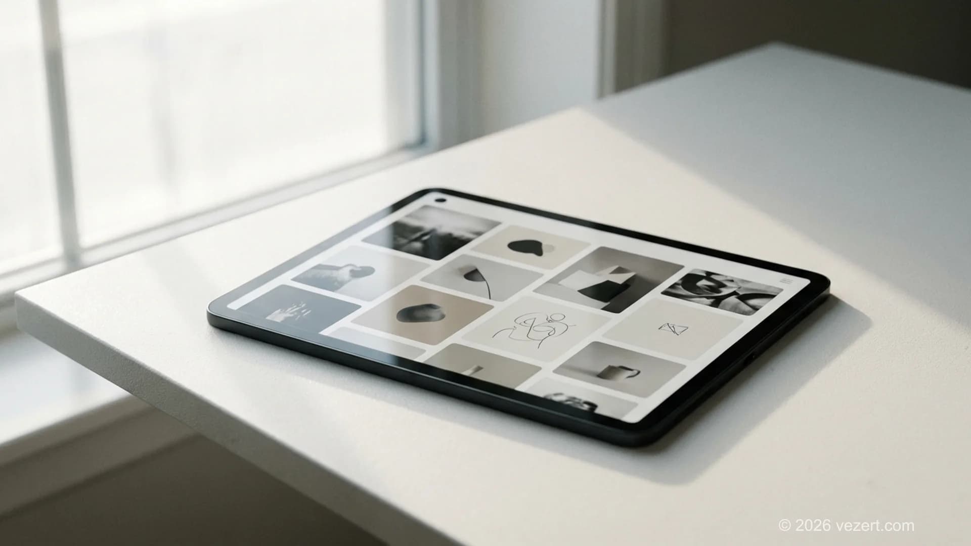
How Bento Grids and Modular Layouts Improve Scanning
If you've visited Apple's product pages recently, you've seen bento grids in action. Named after Japanese lunch boxes, this layout pattern arranges content in asymmetric, card-based blocks of varying sizes. It's modular, scannable, and flexible.
Bento grids dominate tech startup websites in 2026 because they solve a real problem: how do you present multiple features, benefits, or product capabilities without creating a wall of text? The answer is cards. Each card contains one idea, a feature, a stat, a testimonial, a product screenshot, and the varying sizes create natural visual hierarchy.
This pattern works especially well for:
- Feature sections, each card highlights one capability with an icon, short description, and optional micro-animation
- Pricing comparisons, side-by-side cards with clear differentiation
- Social proof blocks, mixing testimonials, logos, and metrics in a dynamic grid
The technical advantage? Bento grids translate beautifully to responsive layouts. Cards can reflow from a multi-column desktop grid to a single-column mobile stack without losing information hierarchy.
Design considerations
Don't make every card the same size, that defeats the purpose. Use larger cards for your most important content and smaller cards for supporting details. Maintain consistent spacing (16px or 24px gaps work well), and use subtle borders or background color variations to separate cards without heavy dividers.
Building a Startup Website That Converts?
We design high-converting landing pages and startup websites using the latest trends that actually drive signups.
Get a Free ConsultationAI-Driven Personalization and Dynamic Content
This one's less about how your site looks and more about how it behaves. AI-driven personalization means your website adapts to each visitor, showing different headlines, CTAs, or content blocks based on who's viewing, where they came from, or what stage of the funnel they're in.
According to Figma's 2025 AI report, 51% of designers working on AI products are now building agent-based features, up from 21% the year before. That shift is trickling directly into web design. SaaS startups are using AI to A/B test headlines in real time, swap hero images based on visitor industry, and adjust pricing page copy based on company size detected from IP data.
This isn't science fiction, tools like Mutiny, Intellimize, and even built-in features in platforms like Webflow and Next.js make dynamic content accessible to teams without machine learning engineers.
The creative web design angle here is that your website is no longer a single, fixed experience. It's a system that responds to context. A developer visiting from a Hacker News link might see technical specs front and center. A marketing director arriving from LinkedIn might see ROI statistics and case studies.
Where to start
You don't need to personalize everything on day one. Start with your hero section, test two or three headline variants based on referral source. Then expand to your CTA copy and social proof sections. The key is treating your landing page as a living system, not a static asset.
Accessibility-First Design Is Not Optional
Accessibility used to be an afterthought, something teams bolted on before launch if they had time. In 2026, the best startups treat it as a design constraint from day one, and their products are better for it.
Why? Because designing for accessibility forces clarity. High-contrast text is easier for everyone to read. Logical heading structures help screen readers and SEO bots alike. Keyboard-navigable interfaces work better for power users who hate reaching for a mouse.
The business case is straightforward: roughly 16% of the global population lives with some form of disability. Ignoring accessibility means ignoring a massive segment of potential users. And with WCAG 2.2 guidelines becoming the baseline standard, non-compliance carries legal risk too.
For tech startups, accessibility-first design means:
- Contrast ratios of at least 4.5:1 for body text, 3:1 for large text
- Alt text on every image, not "image123.png" but actual descriptions
- Focus states on all interactive elements, if you can click it, you should be able to tab to it
- Form labels that are visible, not just placeholder text that disappears on click
- Motion controls, respect
prefers-reduced-motionfor users who are sensitive to animation
This isn't just a checkbox exercise. Teams that build accessible products from the start move faster because they're not retrofitting later. And search engines reward it, accessible markup tends to produce cleaner, more semantic HTML, which is exactly what Google's crawlers want to see.
Organic Aesthetics and the Human Touch
There's a quiet rebellion happening against the hyper-polished, AI-generated aesthetic. In 2026, some of the most memorable startup websites are deliberately imperfect, using hand-drawn illustrations, scribble accents, and organic shapes that feel warm and human.
This makes strategic sense. When every competitor's site looks like it was generated by the same AI tool (because it probably was), a hand-crafted feel becomes a differentiator. It signals that real humans built this, that there's personality behind the product.
The trend manifests in several ways:
- Organic shapes, blobs, flowing curves, and irregular borders replacing rigid geometric containers
- Hand-drawn illustrations, custom sketches and doodle-style icons instead of generic icon libraries
- Soft gradients, smooth color transitions that feel natural, like light falling across a surface
- Textured backgrounds, subtle grain, paper textures, or noise overlays that add warmth
Notice this doesn't mean amateurish. The best examples, like those from brands such as Notion or Figma, balance organic warmth with polished execution. The illustrations are hand-drawn but professionally rendered. The shapes are organic but follow a consistent design system.
This trend pairs especially well with the bold typography trend. A strong, oversized headline set against a soft, organic background creates visual tension that grabs attention.
Why Performance Is the Trend That Never Goes Away
I've listed this last on purpose, because it's not a visual trend. But it underpins every other trend in this article. You can implement beautiful micro-animations, stunning 3D elements, and dynamic personalization, and all of it means nothing if your site takes four seconds to load.
Speed feels like design. Opening a site that loads instantly feels premium. Opening one that stutters and delays feels broken, regardless of how it looks once it finally renders.
The numbers are unforgiving: a one-second delay in page load time can decrease conversions by up to 7%. For a startup getting 10,000 visitors a month with a 3% conversion rate, that's 21 lost signups every month from a single second of latency.
In 2026, Core Web Vitals 3.0 has raised the bar further. Google's performance metrics now factor more heavily into search rankings, which means slow sites get punished twice, once by users who leave, and again by algorithms that deprioritize them.
What high-performing startup websites do:
- Ship less JavaScript, audit your bundle size ruthlessly. If you're loading 2MB of JS for a marketing site, something is wrong.
- Use modern image formats, WebP and AVIF compress better than PNG or JPEG with no visible quality loss.
- Implement lazy loading, don't load images, videos, or 3D scenes until they're near the viewport.
- Choose the right hosting, edge deployment through platforms like Vercel or Cloudflare Pages puts your site closer to users globally.
- Optimize fonts, subset your typefaces to only the characters you need, and use
font-display: swapto prevent invisible text during load.
Performance isn't glamorous, but it's the foundation that makes all the creative trends work. The fastest-loading startup sites in our portfolio consistently outperform the rest in conversion metrics.
Don't chase every trend at once. The smartest approach is to pick two or three patterns that match your product and audience, implement them well, and measure the results. A startup website that nails dark mode, strong typography, and fast performance will outperform one that poorly executes eight different trends. Quality of execution beats quantity of features, always.
Putting It All Together: What Your Startup Should Do Next
The web design trends that matter for tech startups in 2026 have a common theme: they serve the user, not the designer's ego. Micro-animations that provide feedback. Typography that communicates instantly. Dark mode that reduces strain. Layouts that organize complexity. Speed that respects people's time.
Here's the honest truth: most startup websites don't fail because they picked the wrong trend. They fail because they tried to implement too many trends poorly, or because design decisions were made without thinking about conversion. A gorgeous site that doesn't convert is still a failing site.
If you're planning a redesign or building from scratch, here's a practical sequence:
- Start with performance, set a loading budget before you design anything.
- Choose your typographic voice, pick fonts that reflect your brand and test them at every screen size.
- Decide on light or dark, don't try to "support both" as an afterthought. Design one mode thoroughly first.
- Add motion with purpose, start minimal, add animations only where they improve understanding.
- Build trust visually, gather your proof points (logos, metrics, testimonials) before designing the layout.
- Test on real devices, your audience isn't using the latest MacBook Pro. Test on mid-range phones and slow connections.
Your website is your most valuable sales asset. Treat its design with the same rigor you'd apply to your product. And if you need a team that understands how to turn these trends into measurable results, we're here to help.
For a practical look at how these principles apply in the context of business websites that win clients, the lessons from top agency website designs offer concrete patterns worth stealing.
Explore our full range of web design services to see how we help tech startups build websites that look sharp and convert. For founders who invest in their personal brand alongside their product, see how we approached the design challenge in our CTO personal branding case study.
On This Page
- Why Design Matters More Than Ever for Tech Startups
- How Micro-Animations Drive Purposeful Motion
- 3D Elements and Lightweight WebGL Experiences
- Why Bold Typography Acts as a Design Statement
- Dark Mode: From Preference to Expectation
- How Bento Grids and Modular Layouts Improve Scanning
- AI-Driven Personalization and Dynamic Content
- Trust Signals and Conversion-Focused UX
- Accessibility-First Design Is Not Optional
- Organic Aesthetics and the Human Touch
- Why Performance Is the Trend That Never Goes Away
- Putting It All Together: What Your Startup Should Do Next


