


On This Page
- What Accessible Website Design Actually Changes
- What the Six Patterns Look Like in Practice
- How to Get Colour and Contrast Right
- How Keyboard and Focus Order Should Behave
- What Makes a Form Usable Without Sight
- Why Overlay Widgets Do Not Make a Site Accessible
- How to Audit a Site You Already Have
- What Accessible Design Costs When It Is Built In
- Where the Law Actually Applies to You
Accessible website design is design that keeps working when one of the assumptions breaks: the visitor cannot see the screen, cannot use a mouse, cannot hear the video, or is reading on a phone in bright sun with one hand while holding a bag.
Most teams meet the subject as a compliance panic before an audit. That framing produces the worst possible outcome, which is a scramble of patches bolted onto a finished site. Built in from the first wireframe, the same requirements cost almost nothing and quietly improve the site for everyone.
This guide covers the design patterns rather than the specification. It shows what the six recurring failures look like, how to check a site you already have, what the work costs when it is planned rather than retrofitted, and where the law genuinely applies.
What Accessible Website Design Actually Changes
Accessible design is not a visual style, and that is the first thing worth clearing up. Sites that meet the standard look like any other well-made site. What changes is a set of decisions that are usually made unconsciously: how much contrast the text has, what happens when someone presses Tab, whether a form field is still understandable when the placeholder disappears.
According to the W3C's Web Accessibility Initiative, the guidelines rest on four principles: content must be perceivable, operable, understandable and robust. Those four words are more useful than the numbered success criteria when you are briefing a designer, because they map to questions anyone can ask about a mockup.
The commercial argument is simpler than the moral one. Roughly one in six people worldwide lives with a significant disability, and the share rises sharply with age, which matters for any product sold to people over fifty. A site that excludes them excludes buyers, and in most of Europe it now also breaks the law.
What the Six Patterns Look Like in Practice
Six failures account for the overwhelming majority of problems found in real audits, and every one of them is a design decision rather than a coding mistake. Fixing them at the wireframe stage costs nothing; fixing them after launch means reopening finished templates.
- Low contrast text, usually grey on white chosen because it looked calmer in the mockup.
- Missing alternative text, or alt text that repeats the file name.
- Links that say "read more", which a screen reader announces out of context as a list of identical items.
- Forms with placeholder-only labels, which vanish the moment someone starts typing.
- Interactive elements built from plain divs, invisible to assistive technology because they carry no role.
- Video without captions, which excludes deaf users and everyone watching without sound.
Each of these has a fix that takes minutes in a design file and hours in production code. That ratio is the whole argument for handling accessibility as a design constraint rather than an engineering ticket.

How to Get Colour and Contrast Right
Contrast is the single most common failure and the easiest to prevent, because it can be checked before a single line of code exists. The standard asks for a ratio of at least 4.5 to 1 between text and its background for normal text, and 3 to 1 for large text and for the visual boundaries of interface components.
The trap is that brand palettes are chosen on a calibrated monitor in a dark room. A mid-grey that reads as elegant there becomes unreadable on a phone outdoors. Checking the palette at the brand stage, rather than the page stage, prevents a whole category of rework.
Colour also cannot be the only carrier of meaning. A form that marks errors in red and nothing else is unusable for the substantial share of men with colour vision deficiency. Adding an icon and a sentence costs one line and removes the problem.
Finally, the focus indicator. Designers frequently remove the browser's default outline because it clashes with the design, and replace it with nothing. That single decision makes the entire site unusable by keyboard, and it is the most common serious failure we find on otherwise polished work.
How Keyboard and Focus Order Should Behave
Keyboard operation is the fastest way to judge a site, and it needs no tools. Put the mouse aside, press Tab repeatedly, and watch what happens. If you can reach every control, always see where you are, and never get stuck, the site is in reasonable shape.
Three things break in practice. The focus order jumps around because elements were positioned visually rather than ordered in the markup. A modal opens and Tab keeps moving through the page behind it, so a keyboard user cannot reach the close button. And a dropdown that only opens on hover is simply unreachable.
There should also be a way to skip repeated blocks. On a site with a large header and a long menu, a keyboard user otherwise presses Tab twenty times on every single page before reaching the content. A skip link is a few lines of code and one of the highest-value fixes available.
None of this requires a screen reader to evaluate. Tab, Enter, Escape and the arrow keys will surface most of the serious problems in under ten minutes.
The test that takes ten minutes
Unplug the mouse and try to complete your own primary conversion, whether that is a contact form, a booking or a checkout, using only the keyboard. Most teams discover within two minutes that the cookie banner cannot be dismissed, the menu cannot be opened, or the focus disappears entirely somewhere in the middle. Do this before commissioning any audit, because it tells you whether you have a small problem or a structural one.
What Makes a Form Usable Without Sight
Forms are where accessibility failures cost money directly, because a form is usually the conversion. The requirements are unglamorous and short, and almost every commercial site gets at least one of them wrong.
Every field needs a visible label that stays visible. Placeholder text is not a label: it disappears on the first keystroke, leaving anyone who was interrupted to guess what they were filling in. Related fields need grouping so a screen reader announces them as a set rather than as loose inputs.
Errors need to say what to do, not what went wrong. "Invalid input" is useless; "enter the date as DD/MM/YYYY" is a fix. The error also has to be announced, associated with the field, and reachable, which is where a visually pretty error summary at the top of the page often fails.
Time limits deserve a mention because they are invisible until they hurt. A booking flow that expires a session after ten minutes excludes anyone who reads slowly or uses a screen reader, which is a group that takes measurably longer through the same flow.
Why Overlay Widgets Do Not Make a Site Accessible
Overlay widgets, the floating accessibility buttons that promise instant compliance for a monthly fee, deserve a direct answer because they are marketed hard at exactly the people this article is written for.
They do not make a site accessible. An overlay sits on top of the existing markup and tries to guess at meaning it cannot see: it cannot know what an unlabelled image contains, cannot infer the correct heading structure, and cannot repair a custom component that carries no role. What it can do is change font size and colours, which users could already do in their own browser.
The practical argument against them is stronger than the theoretical one. Accessibility advocates and screen-reader users have publicly and repeatedly reported that overlays interfere with their own assistive software, and a widely-signed open letter from accessibility practitioners recommends against them. In the United States, businesses using overlays have still faced accessibility lawsuits.
The honest position is that an overlay is a subscription that buys the appearance of a fix. The underlying markup is what regulators, courts and actual users evaluate.
How to Audit a Site You Already Have
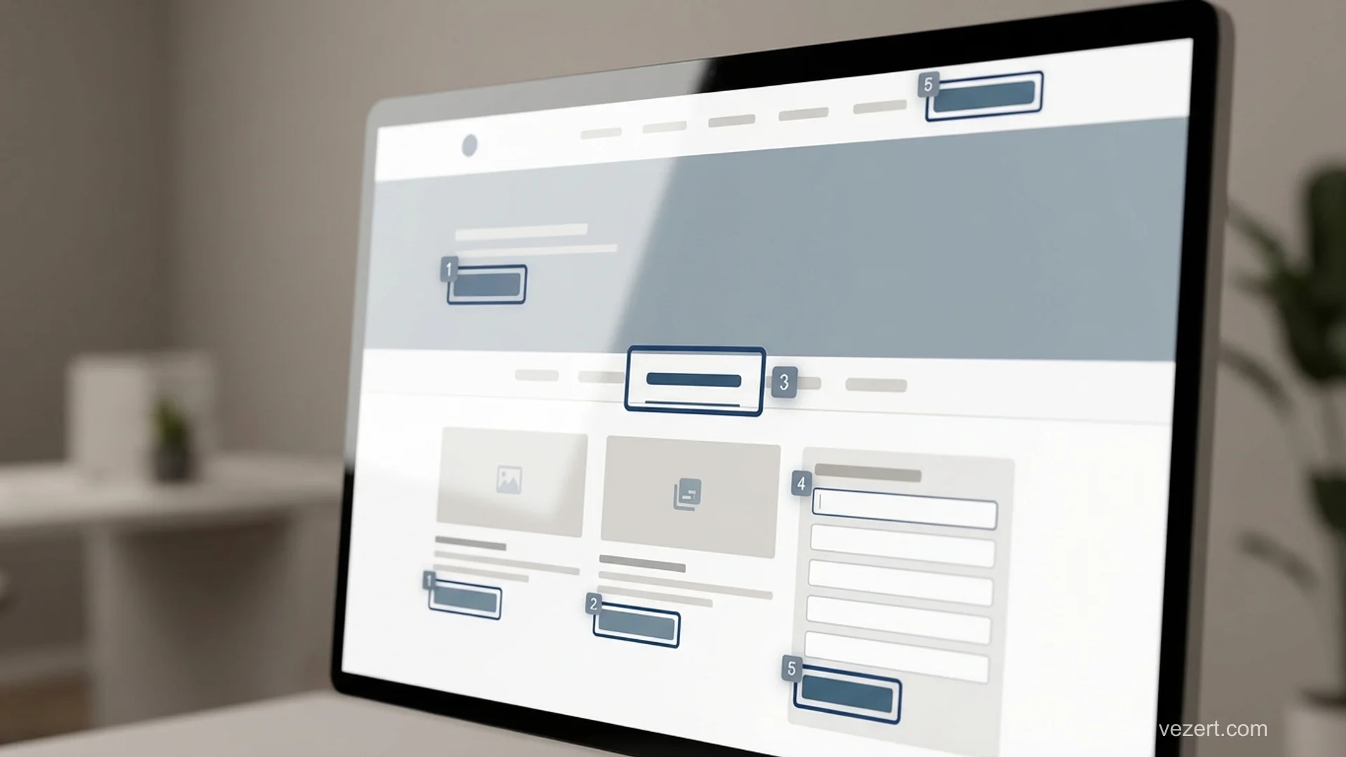
Auditing an existing site works in three passes, and the order matters because each one is cheaper than the next. Running an agency audit first, before the free passes, wastes most of the budget on findings you could have gathered yourself.
The first pass is automated. A browser extension or a command-line checker will find contrast failures, missing alt attributes and unlabelled fields in minutes. Automated tools catch a meaningful minority of real issues, commonly estimated at around a third, so treat a clean automated report as the start rather than the finish. For scale, the annual WebAIM Million analysis of the top million home pages has consistently found detectable WCAG failures on more than 95 % of them.
The second pass is manual and free: the keyboard walk described above, plus checking the page with images disabled and with the browser zoomed to 200 %. This finds the structural problems the scanners cannot see.
The third pass is expert review with assistive technology, and this is the one worth paying for. It covers the things no tool detects, such as whether the reading order makes sense, whether announcements are useful, and whether a task can actually be completed. Book it after the first two passes, not before.
What Accessible Design Costs When It Is Built In
Built into a new site, accessible design adds almost nothing to the bill. The palette check, the focus states, the labelled forms and the semantic structure are decisions rather than extra work, and a competent team makes them by default. On our published pricing a landing page starts at €1,500 and a site of ten to thirty pages at €4,500, and accessibility is inside those figures rather than an option on top.
Retrofitting an existing site is a different economic proposition. Contrast and alt text are cheap. Rebuilding custom components that were made from unlabelled divs, or restructuring a page whose visual order does not match its markup order, is template work, and it typically lands between €2,000 and €8,000 depending on how many templates the site has.
An expert audit with assistive technology on a mid-sized site is usually a four-figure engagement on its own, which is why the free passes should come first.
The number that matters most is not the fix cost but the rework ratio. A contrast problem caught in a design file is a five-minute change. The same problem caught after launch touches every template, the design system and the regression tests.
Where the Law Actually Applies to You
Whether the law applies to you depends on where you sell and what you sell, and the answer changed recently for a large group of European businesses.
In the European Union, the European Accessibility Act applies from 28 June 2025 to a defined list of products and services sold to consumers, which includes e-commerce, banking, e-books, transport and telecoms. It is transposed into national law by each member state, so the enforcement body and the penalties are national rather than European. Microenterprises providing services are exempt from most obligations under the directive, and each country defines the detail.
In the United States, the Americans with Disabilities Act has been applied to commercial websites through litigation rather than through an explicit web regulation for private business, and the volume of filings has made it a live commercial risk rather than a theoretical one.
Public-sector bodies across the EU have been covered for longer by the Web Accessibility Directive, which is why government sites were accessible years before commercial ones. If you sell to the public sector, expect accessibility to appear as a scored requirement in the tender.
The practical takeaway is narrow: check whether your own country's transposition covers your category and your company size before assuming either that you are exempt or that you are exposed. Our guide to corporate website design covers where this sits in a wider build.
Want the accessibility work inside the build rather than bolted on after?
We design and ship [corporate websites](/corporate-websites) with contrast, focus states, labelled forms and semantic structure handled from the first wireframe, and the price published before the call.
See our pricingOn This Page
- What Accessible Website Design Actually Changes
- What the Six Patterns Look Like in Practice
- How to Get Colour and Contrast Right
- How Keyboard and Focus Order Should Behave
- What Makes a Form Usable Without Sight
- Why Overlay Widgets Do Not Make a Site Accessible
- How to Audit a Site You Already Have
- What Accessible Design Costs When It Is Built In
- Where the Law Actually Applies to You